Containers
Containers are essential for wrapping content to ensure it does not grow too wide and lose its structure. They act as a boundary that maintains the readability and visual balance of the content.
It is highly recommended to use a container to set a maximum width for your content to the minimum width of the current breakpoint. This approach ensures that the content remains centered and visually appealing, especially on larger screens.
Content wrapped in a container
<div class="container"> <p class="bg-background shadow-md text-foreground p-8">Content wrapped in a container</p></div>Content layout
Digital Design Nizam does not advocate for using rigid grid systems, such as a 12-column grid, for layout design.
Instead, it recommends splitting layouts into flexible fractions like 1/2, 1/3, 1/4 etc. This approach ensures that the design remains responsive and adapts predictably to different screen sizes.
Additionally, components like avatars, buttons, and similar elements should fit their respective content rather than filling the available space.
<div class="flex gap-4"> <div class="w-1/4 bg-background shadow-md text-foreground text-center p-8">Column 1</div> <div class="w-3/4 bg-background shadow-md text-foreground text-center p-8">Column 2</div></div>Right-to-left direction
When switching designs from left-to-right (LTR) to right-to-left (RTL), it is not sufficient to simply align text to the right.
The entire layout of the page must shift to flow from right to left. This includes reversing the direction of components, such as navigation menus, sidebars, and content alignment.
Additionally, transitions and animations should also switch direction to maintain a natural flow for RTL users.
Example of the same card element as above, but in RTL direction using the dir="rtl" attribute.
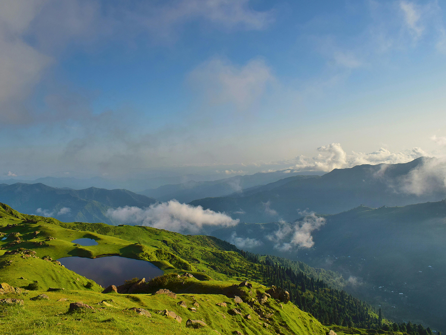
Over line text
Title goes here
Lorem ipsum dolor sit amet, id nulla regione euismod vis, zril gloriatur assueverit ex quo. Ius habemus evertitur id.
<div dir="rtl" class="flex flex-col md:flex-row w-full bg-surface shadow-md text-foreground"> <div class="w-full min-h-64"> <img src="/landscape.png" alt="Mountain landscape with green hills and clouds" class="w-full h-full object-cover"> </div> <div class="p-6 flex flex-col gap-4"> <p class="text-muted text-sm font-semibold">Over line text</p> <p class="font-semibold">Title goes here</p> <p>Lorem ipsum dolor sit amet, id nulla regione euismod vis, zril gloriatur assueverit ex quo. Ius habemus evertitur id.</p> <div class="flex flex-wrap gap-4"> <a href="#" class="px-6 py-3 bg-primary text-white font-semibold text-center no-underline"> Get Started </a> <a href="#" class="px-6 py-3 bg-zinc-500/10 text-foreground font-semibold text-center border-b-2 border-zinc-500/20 no-underline"> Learn More </a> </div> </div> </div>