Usage instructions
Usage in Figma
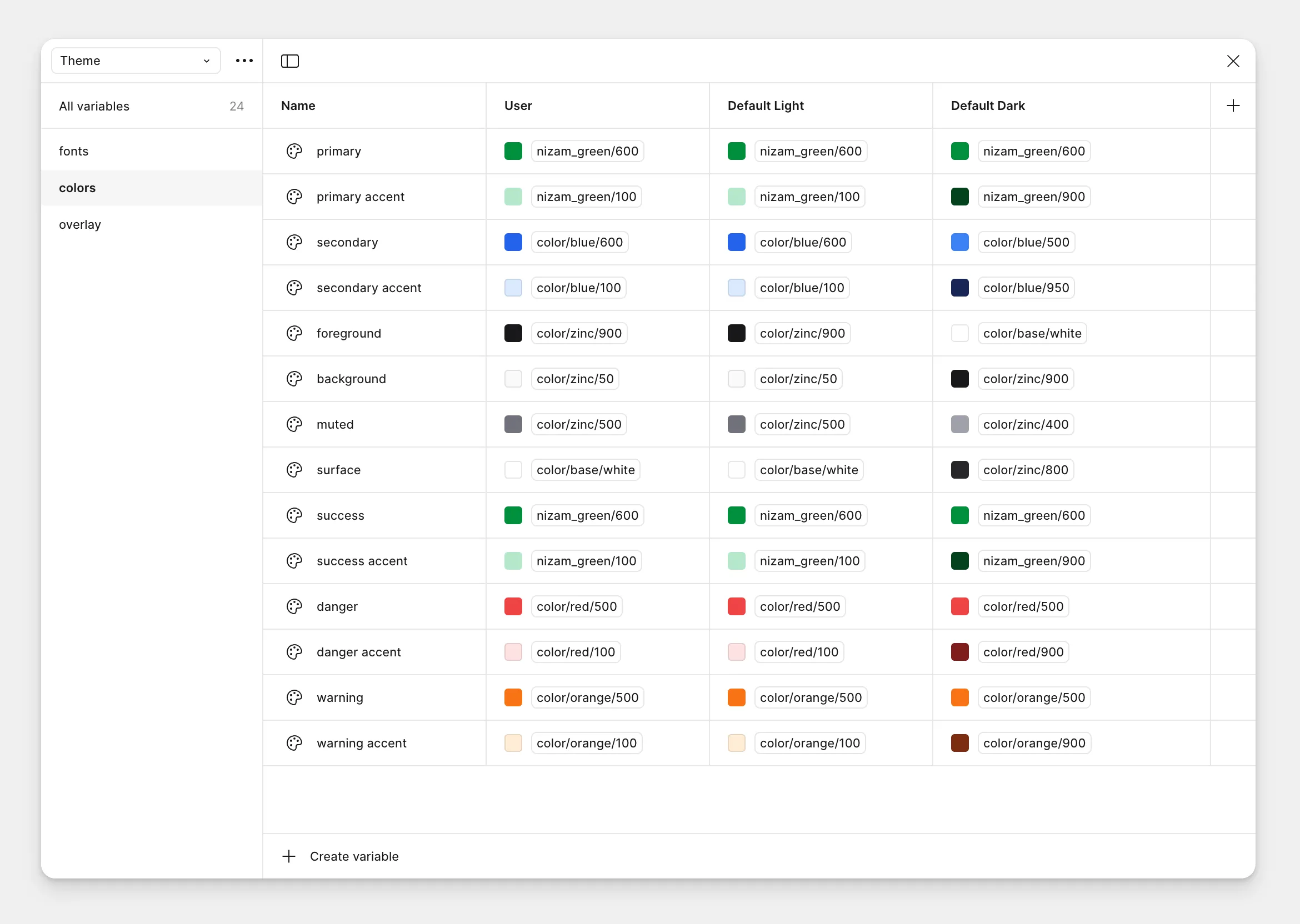
There are 3 default variable modes for colors: User, Default light and Default dark. All Theme color values get updated automatically when variable mode is changed betwen Default light and Default dark.
Customization
You may customize your theme colors by editing the ‘User’ mode, which is same as the Default light mode.
Usage in Web
Default values included in the theme.css file. To customize, edit the color variables in the theme.css file.
You can use the following theme colors using Tailwind class prefixes of color- and bg-. RGB values are used instead of Hex values because of limitation of Tailwind 3.4.
Corresponding dark mode values are updated automatically when the attribute of data-theme="dark" is applied to the page or class="dark" is applied to an element.
class=“bg-primary”class=“bg-primary_accent”class=“bg-secondary”class=“bg-secondary_accent”class=“bg-foreground”class=“bg-background”class=“bg-surface”class=“bg-muted”class=“bg-success”class=“bg-success_accent”class=“bg-danger”class=“bg-danger_accent”class=“bg-warning”class=“bg-warning_accent”Customization
To customize the theme colors, edit the CSS variables in the theme.css file. You can also add your own custom colors by adding them to the theme.css file.
/* Edit these theme colors to customize */
/* Light mode */
:root {    --color-primary: 0 143 60;    --color-primary_accent: 182 231 203;    --color-secondary: 37 99 235;    --color-secondary_accent: 219 234 254;    --color-foreground: 24 24 27;    --color-background: 250 250 250;    --color-surface: 255 255 255;    --color-muted: 113 113 122;    --color-success: 0 143 60;    --color-success_accent: 182 231 203;    --color-danger: 239 68 68;    --color-danger_accent: 254 226 226;    --color-warning: 249 115 22;    --color-warning_accent: 255 237 213;}
    /* Dark mode */
:root[data-theme~="dark"], :root[class~="dark"], .dark {    --color-primary: 0 143 60;    --color-primary_accent: 1 65 28;    --color-secondary: 59 130 246;    --color-secondary_accent: 23 37 84;    --color-foreground: 255 255 255;    --color-background: 24 24 27;    --color-surface: 39 39 42;    --color-muted: 161 161 170;    --color-success: 0 143 60;    --color-success_accent: 1 65 28;    --color-danger: 239 68 68;    --color-danger_accent: 127 29 29;    --color-warning: 249 115 22;    --color-warning_accent: 124 45 18;}
All colors
All colors include the custom ‘Nizam Green’ color set and stock Tailwind colors. Visit Tailwind’s documentation page on colors to learn more.